After 50: eye specialists share the reading light colour that causes less strain in the evening
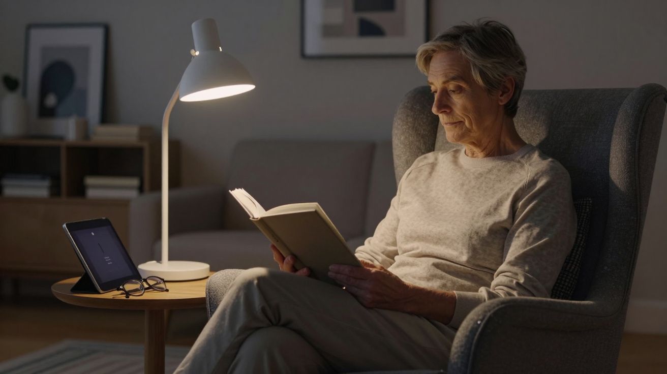
You’re half‑way through a chapter, the room is quiet, and then it starts: the text loses contrast, your eyes feel sandy, and your temples begin to throb. You hold the book a little farther away; the letters don’t get sharper. At some point the lamp feels as much to blame as your glasses.
For many people over 50, the question sneaks in during evenings like this: is there a “right” colour of light for reading, one that keeps the words clear and the eyes calmer?
Ophthalmologists and optometrists don’t promise miracles. They do, however, keep circling back to the same answer: what your eyes want at night is less drama and more daylight.
What changes in your eyes after 50
From around your mid‑40s, the lens inside the eye starts to stiffen. By your 50s and 60s, this presbyopia is the main reason close print becomes a negotiation. At the same time, the clear window at the front of the eye and the lens gradually yellow. That filters the light reaching the retina.
Two things happen as a result:
- You need more light for the same task than you did at 30.
- Blue‑rich light scatters and dazzles more easily, especially on tired eyes.
So the goal in the evening is simple: enough light, but not the kind that feels like a tiny searchlight aimed straight at your retina.
The sweet spot most specialists point to: a neutral, daylight‑like white in the warmish range – not orange, not icy blue.
The colour that strains less in the evening
Ask ten eye specialists about evening reading lamps and a pattern appears. They tend to recommend a warm to neutral white light, roughly in the 2700–3000 Kelvin range, sometimes up to 3500 K if you prefer it crisper.
In plain language, that means:
- No harsh blue‑white “daylight” bulbs over 4000 K near bedtime.
- No extremely amber, dim “mood” light as your only reading source.
- A steady, warmish white that still makes black print look clearly black.
Cool, blue‑leaning light can make contrast pop on a page, but it also:
- Produces more glare on shiny paper or screens.
- Feels harsher for dry eyes or early cataracts.
- Interferes more with melatonin, nudging your body clock later.
Very warm, orange light on the other hand looks cosy, yet can make fine print and low‑contrast fonts blurrier. After 50, that softness costs effort.
Quick comparison: evening reading light
| Light colour | Typical Kelvin | Evening reading comfort |
|---|---|---|
| Cool white / “daylight” | 4000–6500 K | Crisp but often glaring; more eye and sleep disruption |
| Warm–neutral white | 2700–3500 K | Best balance of clarity, comfort, and sleep‑friendliness |
| Very warm / amber | < 2500 K | Cosy but can reduce contrast; often too dim as main light |
Why “daylight bulbs” can backfire at night
The marketing language is tempting: daylight, focus, clarity. For office work at 11am, cool white can be helpful. After dinner, it often creates more strain than support.
Eye doctors highlight three main issues with blue‑rich evening light:
Increased scatter and halos
Age‑related changes in the lens and cornea scatter short‑wavelength light more. That means starbursts, haze around bright points, and quick fatigue.Amplified dryness
Many people blink less while reading. Cooler light can highlight every tiny irregularity on a dry eye surface, so text seems to shimmer.Body clock delay
Strong blue content in the last two or three hours before bed signals “daytime” to your brain. You may fall asleep later and feel less restored.
A softer, warm‑neutral lamp won’t cure presbyopia, but it reduces extra obstacles. The idea is not to flood your evening with darkness, but to turn down the blue drama.
It’s not just the colour: brightness and direction matter
Colour gets the headlines, yet specialists repeat the same quiet warning: a perfect Kelvin value won’t help if the lamp shines directly in your eyes or barely lights the page.
Three levers to adjust:
Brightness
After 50, you often need about twice as much light for comfortable reading as in your 20s. That doesn’t mean a spotlight – it means a stable, generous pool of light on the page.Direction
The lamp should light the reading surface, not your pupils. Over‑the‑shoulder or from slightly behind and to the side works better than straight in front.Contrast, not just watts
A matte page, clear font and minimised reflections do as much for comfort as the bulb itself. Glossy pages plus bare, glaring LEDs are a fast route to squinting.
Aim for this test: the page is bright and evenly lit, but you cannot see the bare light source from your usual reading position.
How to choose a lamp if you’re over 50
Eye specialists tend to offer pragmatic advice rather than brand names. When buying or adjusting a lamp, they look for a few key clues on the box and in the room.
1. Check the label
On the packaging or product page, look for:
- Colour temperature: 2700–3000 K (up to 3500 K if you prefer a slightly cooler look).
- High CRI (colour rendering index): 90+ if possible, for natural text and skin tones.
- Dimmable: so you can go brighter for newspapers, softer for novels in bed.
2. Test in real conditions
Shops are bright and misleading. Try your lamp:
- With your usual reading glasses on.
- In the room and chair where you actually read at night.
- For at least 10–15 minutes, not just a quick glance.
Notice whether your eyes feel dry, whether the page seems to shimmer, and whether white areas of the page “glow” back at you. If they do, reduce brightness or reposition the lamp before blaming your prescription.
3. Pair lamp and glasses wisely
For many over‑50s, task‑specific reading glasses matter more than the bulb:
- Have your optometrist check for the distance at which you usually read (book vs tablet vs armchair).
- Consider lenses with a mild blue‑light reduction only if you use screens at night; for paper, good lighting is usually enough.
- If you have cataracts forming, ask whether slightly warmer light (towards 2700 K) helps reduce glare.
Screens, e‑readers and night modes
Not everyone reads from paper anymore. Tablets, phones and e‑readers change the lighting equation because the light comes from inside the device.
Eye specialists generally suggest:
- Use “night” or “warm” modes in the evening, which reduce blue and shift towards amber.
- Keep brightness just high enough to see text sharply; avoid the maximum setting.
- Maintain a comfortable distance (not right up to your nose) to reduce accommodation strain.
If you use an e‑reader with front lighting, the same rule applies: a warm or amber setting, moderate brightness, and a dark, non‑reflective background behind you work best. Think of the device as both book and lamp in one – you are still deciding its colour and intensity.
Simple evening habits that ease eye strain
Light colour is one piece of the puzzle. Small routine shifts make that warm‑neutral lamp more effective.
- Follow the 20‑20‑20 guideline: every 20 minutes, look 20 feet away for about 20 seconds.
- Blink deliberately a few times when your eyes feel dry; lubricating drops can help if recommended for you.
- Avoid reading while lying flat on your back, which often puts the lamp in your direct line of sight.
- Stop trying to “push through” blur. If you’re stretching your arms or lifting your glasses to read, it’s time for a check‑up.
Less squinting, more resting: the most eye‑friendly lamp can’t fix an outdated prescription.
When to speak to an eye care professional
If evening reading has become a battle, don’t only blame the bulbs. Book an appointment if you notice:
- Frequent headaches or brow ache after reading.
- Double vision, ghosting of text, or wavy lines.
- Sudden changes in how bright or dark things appear.
- Needing dramatically more light than your peers to see the same page.
These can be signs of presbyopia, cataracts, dry eye, or in rarer cases something more urgent. Getting the medical side checked lets your lamp do what it’s good at: making the last chapter of the day gentle instead of gruelling.
FAQ: - Is there one “best” light colour that suits everyone over 50? Not exactly. Most specialists suggest warm–neutral white (around 2700–3000 K) as a safe starting point, then adjust a little cooler or warmer according to your comfort and vision needs. - Are amber “sleep bulbs” ideal for reading? They’re very kind to your body clock but can be too dim or too orange for clear reading, especially with small print. They work well as background light, with a slightly brighter warm‑white task lamp on the page. - Do blue‑blocking glasses replace the need for warm light? They can reduce blue exposure, particularly from screens, but they don’t correct poor positioning or inadequate brightness. A sensible lamp plus appropriate glasses is more effective than relying on coatings alone. - Can the wrong light colour damage my eyes permanently? In normal home settings, the main risk is discomfort, not permanent damage. Long‑term overexposure to very bright, blue‑rich light close to the eyes may contribute to fatigue and sleep disturbance, which is why moderation and distance matter. - If I already have cataracts, should I change my bulbs? Often yes. People with cataracts frequently report less glare and easier reading with slightly warmer, evenly diffused light and shades that hide the bare bulb from direct view. An eye specialist can tailor advice to your specific case.



Comments (0)
No comments yet. Be the first to comment!
Leave a Comment